Click the HTML icon in the toolbar above to edit spacer height.
TO EDIT: Change the class="spacer-3" to any number between 0 (none) and 5 (most) to resize a spacer. Ex. class="spacer-5"
Vertical spacers are responsive and 50% smaller on mobile than on tablet+.

Open Systems Receives Frost & Sullivan Award

Frost & Sullivan Presents Open Systems with Best Practices Enabling Technology Leadership Award for Global Managed SASE Industry


Frost_Sullivan_OSAward_Graphic.png

Click Image to Enlarge

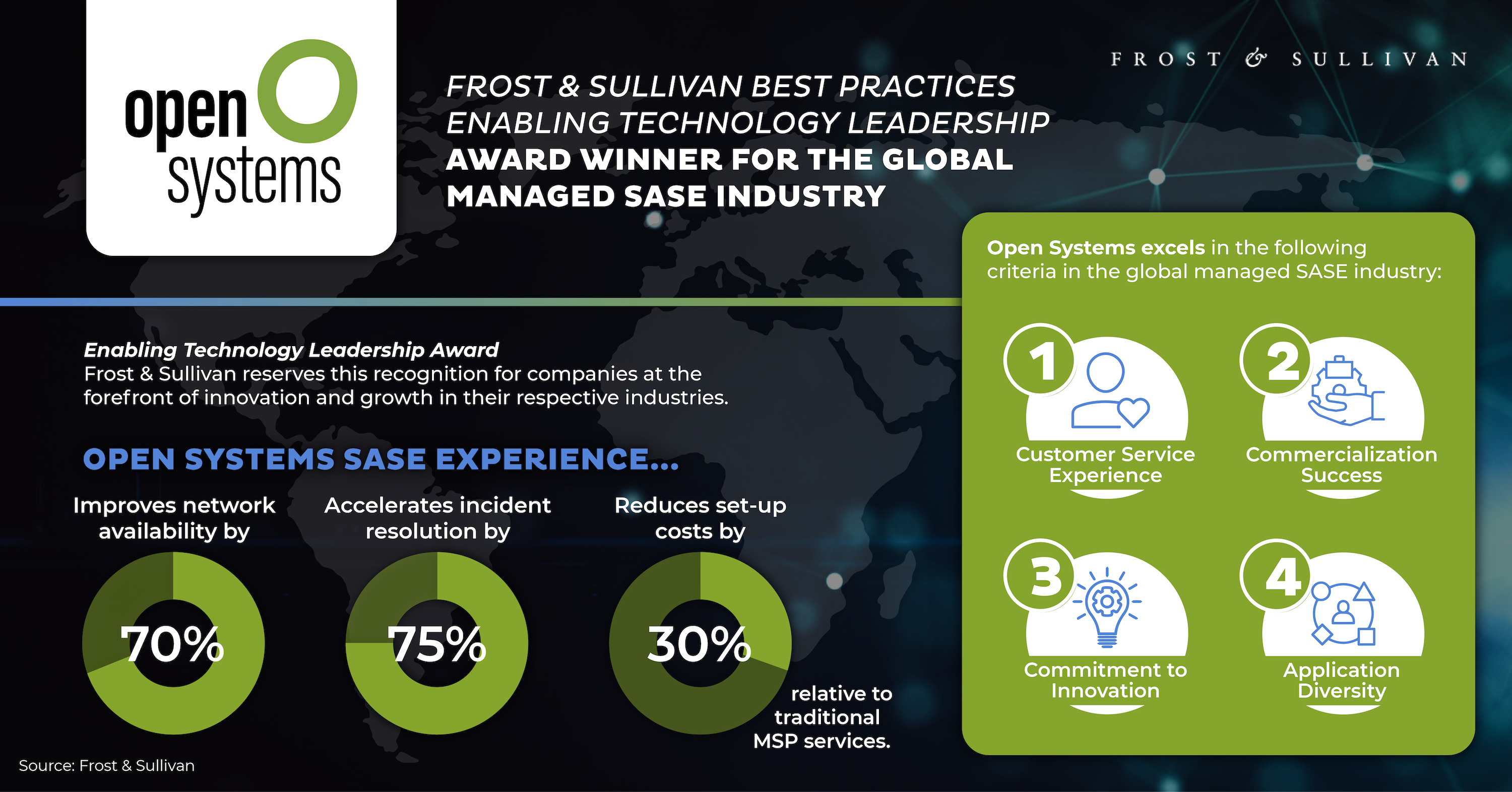
Open Systems has been recognized by independent research and consulting firm, Frost & Sullivan, as a leader in the global managed SASE industry and has been presented with a 2024 Best Practices Enabling Technology Leadership Award. Frost & Sullivan reserves this recognition for companies at the forefront of innovation and growth in their respective industries.

“When enterprises move from legacy security hardware infrastructure to a SASE environment, they get better security and often dramatic operating cost reductions. Adopting a managed-SASE service like Open Systems also gives them SLA-guarantee peace of mind and predictable security budget-forecasting.” – Toph Whitmore, Industry Director, Cybersecurity

Key takeaways from Frost & Sullivan’s evaluation of Open Systems include:

  1. A stand-out commitment to customer service quality that is embodied in the way it puts its most valuable human resources on the customer-support front lines.
  2. A clear understanding of the importance of managed SASE services to mid-size enterprises.
  3. A platform that is ideal for hybrid work environments where customer assets and resources are spread across the cloud, private internet sites, and in internal data stores.


Simply fill out the form to read the full Frost & Sullivan analysis of the Open Systems SASE Experience.


Click the HTML icon in the toolbar above to edit spacer height.
TO EDIT: Change the class="spacer-3" to any number between 0 (none) and 5 (most) to resize a spacer. Ex. class="spacer-5"
Vertical spacers are responsive and 50% smaller on mobile than on tablet+.
Block 1
editable text
Block 2 Top
editable text
Block 2 Bottom
editable text
grows to fill column
Block 3 Top
editable text
Block 3 Bottom
editable text
grows to fill column
Block 4
editable text